
Top Room Paint Colors for Every Room in Your House in 2025
If you think room paint colors don’t matter that much, let me gently introduce you to the reason your living room feels like a dentist’s waiting area. Yes — color is doing more to your mood, sleep, appetite, and bank account than that overpriced accent chair ever will. Most people pick wall colors the same way they choose socks: vaguely neutral, questionably clean, and mostly forgettable.
But 2025 is not the year for timid paint. This is the year color grows teeth — and every room in your house deserves something more than “it works, I guess.” Whether you’re painting for peace, personality, or property value, what you put on your walls can quietly make or murder a space.
So let’s break it all down — room by room — with honest guidance.
Why Room Paint Colors Matter in 2025
If you’re wondering why your place looks oddly flat no matter how much money you spend on furniture, here’s the quiet truth: room paint colors are doing most of the emotional heavy lifting in your home — whether you get them right or not.
And in 2025, they’re pulling even more weight.
Thanks to a delightful mash-up of rising anxiety levels, tighter budgets, and more time spent at home, people are demanding a lot more from their walls than “looks nice.” Paint now has to relax, energize, reflect your style, and make rooms feel bigger — and that’s not even counting the aesthetic guilt trip of scrolling through home decor trends on Instagram.
But paint’s not just a vibe — it’s chemistry. Reds and oranges can raise your heart rate, which works in the kitchen or living room, but might wreck your chances of decent sleep. Cooler hues like sage, muted blue, and off-white reduce cortisol — which matters when your entire life has started blending into one long Zoom call.
Room size and lighting also mess with paint perception in ways even experienced homeowners underestimate. Daylight shifts paint tones by the hour. A warm white under LED can suddenly read sterile and cold. Tiny rooms get swallowed by dark tones, but oddly, oversized ones look disjointed with too much white space. Color needs context — or it backfires.

Here’s what’s trending (for good reason):
Modern paint colors that pull from nature — like clay, stone, sage, muted navy
Bold accents used sparingly (yes, finally, restraint matters)
Color choices that double as personality tests — forget generic grays
Cozy neutrals that aren’t lifeless beige — the 2025 version has depth, warmth, and a point of view
Paints that actually help resale value
Whether you're repainting a single wall or giving your entire home a color audit, the point is this: if you’re still defaulting to the same five colors your builder used in 2004, you’re actively making your space work against you.
Room-by-Room Paint Color Recommendations
We’re not here to coddle beige. Each room has a job to do, and your walls can either help or make you regret every decision you’ve ever made at Home Depot.
Here’s how to get it right, one room at a time, backed by color psychology, verified data, and just enough sass to save you from yet another bad Pinterest hack.
Living Room
This is your house’s press secretary. It speaks first and loudest.
If your living room paint color ideas revolve around eggshell white, brace yourself: the 2025 crowd will judge you — silently, but harshly.
Go for colors that feel like a warm exhale:
Sherwin-Williams’ “Antiquarian Brown” – a muddy, rich neutral that’s surprisingly easy to style
Benjamin Moore’s “October Mist” – a sage green that practically screams, “I read architecture blogs now”
They don’t just look good — they invite people to stay, and they play well with different lighting setups and furniture tones. Modern paint colors like these are dominating current home decor trends for a reason.
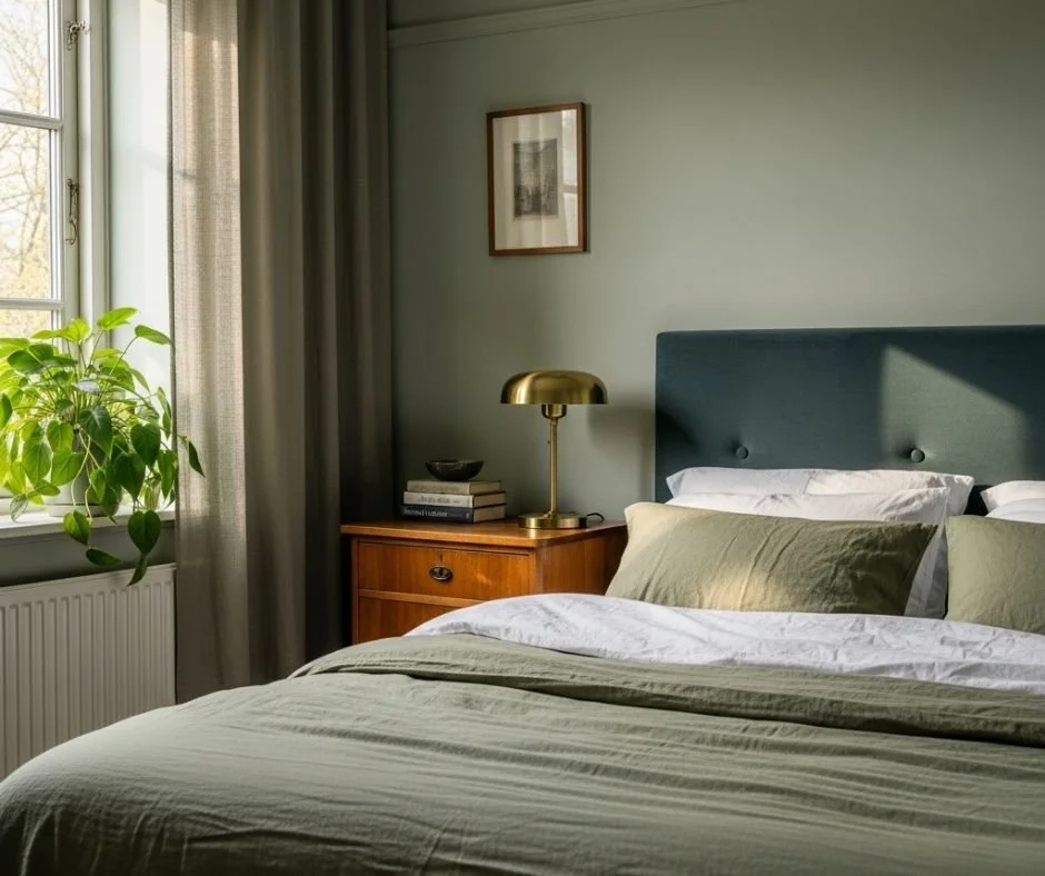
Bedroom
If your bedroom walls are the color of dishwater, don’t act surprised when you’re still awake at 2am scrolling nonsense.
Bedrooms should feel safe, quiet, and a little indulgent. Think soft but grounded. Gray’s not dead, but it’s had enough.
Try:
Sherwin-Williams’ “Slate Tile” – not your average blue; it’s like a wool blanket for your eyeballs
Benjamin Moore’s “Pashmina” – soft and earthy, ideal for anyone allergic to icy pastels
And yes, if your room is small, skip dark colors on all four walls unless you’re into the submarine vibe. Lighter interior design colors stretch walls, especially under warm lighting.
Kitchen
If your kitchen walls are still “builder white,” you’re basically cooking inside a napkin.
2025 kitchens are swinging back to warmth — but not chaos. Like clean greens, muted yellows, and whites with a pulse. It’s less “clinical clean,” more “fresh start.”
Strong options:
Behr’s “Back to Nature” – a soft, almost edible green that somehow works with every cabinet color
Sherwin-Williams’ “Alabaster” – not new, but still relevant in the world of modern paint colors
And yes, kitchens with color contrast (not monochrome) test better for perceived cleanliness and comfort.
Bathroom
The bathroom is where everyone pretends not to judge, but absolutely does.
Nobody wants to brush their teeth in a space that looks like it belongs to a 2003 motel. And don’t get fancy with high-gloss finishes unless you like showing off water stains.
Try:
Benjamin Moore’s “Hale Navy” – surprisingly moody without turning into a cave
Sherwin-Williams’ “Sea Salt” – gentle, subtle, and doesn’t fight your tiles
They’re ideal for humid spaces and stay readable even under strange bathroom lighting. Wall paint inspiration starts in this room — don’t waste it on basic.
Dining Room
This is the one room where drama still belongs.
Dining rooms in 2025 are saying, “We know how to host,” not “We inherited Grandma’s floral border.”
Push boundaries with:
Farrow & Ball’s “Card Room Green” – deep and grounded, perfect with wood or brass
Behr’s “Rumors” – a red that doesn’t feel like a ketchup stain on the wall
The bolder the better — especially paired with minimalist furniture. It’s all part of the interior design colors cycle where contrast gets remembered, not safe choices.
Home Office
Work from home? Then your walls should work too.
There’s nothing inspiring about another grayscale setup that screams “printer paper.” Focus-boosting colors have made the leap from lab-tested to living room — and they’re surprisingly stylish.
Try:
Benjamin Moore’s “Sparrow” – rich brown with subtle undertones that reduce eye fatigue
Sherwin-Williams’ “Evergreen Fog” – just enough green to keep you awake without buzzing
Studies show color-coordinated spaces boost productivity by up to 25%. Don’t sabotage your own workflow.
Hallway
The most ignored square footage in the house — and it shows.
Hallways should connect, not confuse. The key is cohesion. Use colors that make everything feel intentional, even if the doors don’t match yet.
Solid picks:
Sherwin-Williams’ “Shoji White” – soft without being bland
Benjamin Moore’s “Revere Pewter” – still the king of transitional tones
They work with most modern paint colors and tie your whole-house color schemes together without making it obvious.
Every choice above is rooted in how real homes function — not just what influencers slap on drywall for a weekend photo-op. If you're overwhelmed, that’s also normal. But bad paint costs more than just regret — it tanks resale, sucks energy, and makes everything else you try feel off.
So skip the fourth trip to the hardware store and find a trusted residential painting company that understands that paint is strategy.
2025 Paint Color Trends and Palettes
Let’s just say it: “timeless” is often just code for “won’t offend anyone.” But that’s not what 2025 is about.
This year’s paint trends finally stopped trying to please everyone — and started doing something better: making sense.
Not hype. Not noise. Just good, grounded design principles backed by color psychology, sustainability science, and — you guessed it — actual visual harmony. If you’re still stuck googling colors to paint your room and scrolling through feeds that all look the same, here’s what actually matters:


Earthy tones that do more than “look cozy”
Yes, the cozy room colors trend is still going — but this time, it's growing roots. Instead of flat beiges and overused greiges, 2025 is favoring grounded shades pulled straight from nature. Not “inspired by.” Literally taken from clay, stone, and bark.
Colors like Sherwin-Williams’ “Redend Point” or Benjamin Moore’s “Cinnamon Slate” aren’t trendy — they’re sane. And that’s their power. Earthy tones reduce visual anxiety, work in nearly every lighting condition, and anchor even the loudest furniture choices. They also happen to complement nearly all popular room color schemes.
Bold accents for people with taste (and restraint)
Before you throw navy on every wall and call it “moody,” here’s the deal: bold accent colors only work when they’re treated like seasoning, not the whole meal.
In 2025, people are leaning into striking contrasts — emerald greens, rust reds, and saturated ochres — but they’re doing it intentionally. Try painting one wall in a rich tone, then pairing it with neutral furniture and natural light. It’s one of the rare house painting ideas that works just as well in dining rooms as it does in entryways or reading nooks.
Low-VOC paints — because no one wants cancer with their color
This shouldn’t still be considered “optional,” but here we are. Low-VOC paints are the obvious default in 2025 — they’re safer for your lungs, your pets, your walls, and your future self.
If your paint smells like a chemistry lab, you're doing it wrong. Brands like Benjamin Moore Natura and Sherwin-Williams Harmony deliver exactly what they promise: sustainability that doesn’t look or feel like a compromise. This matters even more in enclosed spaces or when you’ve got projects that span multiple rooms.
And if you're redoing the outside, you can always discover residential exterior painting solutions from trusted companies who actually prioritize low-VOC options.
Textured finishes: finally, a reason to touch your walls
Flat paint is functional. Textured paint is deliberate. 2025 is giving love to limewash, chalk-finish, and Venetian plaster, because let’s face it: your walls can do more than just sit there.
Textured finishes add dimension without pattern fatigue. Use them in dining room paint colors to create softness under low light, or in hallways where they can mask minor scuffs without looking “busy.”
Palettes that don’t fight your furniture
Here’s how 2025 does room color schemes right:
Monochromatic: Not boring if done right. Vary tones and finishes within the same color family — think pale green walls, moss trim, deep forest accents.
Complementary: Blue and orange, purple and yellow — they don’t have to scream. Use muted, earthy versions to bring depth without Disney energy.
Analogous: A sneaky favorite of interior stylists. Stick to three colors next to each other on the wheel (like rust, terracotta, peach), and you’ll end up looking like you hired a designer.
Tips for Choosing and Applying Paint Colors
No one warns you about the part where your “perfect” color looks like a bruise under your bedroom lamp. Or that your hallway somehow reflects more green than the swatch ever suggested. You don’t need theory — you need survival skills.
Here's what works.

Swatches lie. Test the paint.
Paint on a poster board. Move it around the room. Look at it under real lighting — morning, afternoon, artificial. Colors mutate, and lighting brings out undertones that didn’t even exist in the store. What looked beige might go lilac under LEDs. What looked sage might go swamp.
Don’t get cute. Paint swatches are flirtatious liars — treat them like one-night stands until proven worthy.
Not all sheens are the same
People love to skip this step — and then wonder why their brand-new bedroom reflects every fingerprint like it’s under forensic light.
Here's how paint finishes actually work:
Matte/Flat: Hides flaws, but scuffs easily. Ideal for ceilings or grown-up bedrooms with zero foot traffic.
Eggshell/Satin: The Swiss army knife of finishes. Soft enough for walls, durable enough for scrubbing. Perfect for cozy room colors in spaces that get used.
Semi-Gloss: Shiny, durable, and basically built for baseboards and bathrooms.
Gloss: Not for the faint of heart. Use it on doors or trim when you want a sleek look — or need wipeability every 48 hours.
Choose wrong, and you’ll either repaint in six months or avoid touching your walls entirely.
Small rooms? Use logic, not trends.
If you’re working with small spaces, the usual rule applies: go light or go layered.
Light neutrals stretch space. But don’t just default to white. Soft creams, warm grays, even desaturated greens open rooms up without feeling sterile.
Accent walls can also help visually elongate spaces when used correctly (don’t paint the shortest wall in the darkest color).
High-traffic zones = high-function finishes
You don’t need expensive paint — you need smart paint. Pick durable, washable formulas for areas like hallways, kitchens, kids' rooms, and entries. And prep properly. Dirty walls or bumpy patches will sabotage even the best product.
For these zones, the best house painting ideas involve color that hides scuffs (mid-tone neutrals) and finishes that survive elbows, paws, and backpacks (satin or semi-gloss). Add in paint designed to resist mildew or grease if it’s near food or moisture.
Prepping: the step that saves your future self
Clean your walls. Fill the nail holes. Sand down the weird bumps from that time you patched a hole with toothpaste (yes, we know). Use painter’s tape like a grown-up. Prime if the surface is uneven or stained.
Do it right, and your paint job will look clean, last longer, and won’t peel the moment your AC runs too long.
Still unsure if your “soft wheat” looks like bad cafeteria lighting? Or if your moody olive just reads like a sickly hallway? That’s what professionals are for.
Instead of playing games with swatches and wishful thinking, book a consult with Paint Coat & Seal’s interior painting services. You'll get answers from people who do this full-time — and actually care about the difference between subtle elegance and unfortunate taupe.
Color Theory and Lighting Considerations
Before you pick a single shade, let’s clear one thing up: paint color isn’t just about taste — it’s about physics and perception. No one tells you that when you fall for “Soft Linen” in the store, it’s going to look like a sad khaki under your hallway bulb. But here we are.
Here’s the unskippable crash course no one gave you on color theory.

Warm vs. Cool
Colors fall into two gangs: warm tones (reds, oranges, yellows) and cool tones (blues, greens, purples). Warm tones feel intimate and energetic — great for rooms where you want interaction. Cool tones pull focus inward — helpful in bedrooms, offices, or when you’re trying not to throttle your family on a Tuesday afternoon.
But here’s the trick: neither group is “better.” They just behave differently depending on your space, your light, and your goals. What feels cozy in a swatch might feel straight-up confrontational on a full wall. Especially when your lighting betrays you — and it will.
Natural vs. Artificial Lighting
You can nail your home interior colors and still end up with a room that looks like it was designed by accident — all because your lighting hijacked your original choice.
Here’s the truth:
Natural light changes throughout the day. Morning sun will bleach out warm colors. Late afternoon deepens them. North-facing rooms lean cool. South-facing rooms wash everything warm.
Artificial light distorts like crazy. Incandescents warm things up. LEDs cool them down. Fluorescents make everything look like tax season.
This is why paint colors for small rooms or oddly lit corners never match the Pinterest version — and why you're better off testing samples than trusting influencers.
Room Color Schemes Only Work When Light Cooperates
The most flawless whole-house color schemes unravel if the lighting isn’t considered from the start. This is where basic color theory meets practical reality.
For example: putting a cool gray in a low-light hallway turns it into a dungeon. Throwing a warm beige in a room with already-orange lighting is how you end up with walls that look like dehydrated mustard.
Balance is the game here. Pair cool lights with warmer hues. Use soft whites with daylight LEDs. Don’t try to correct a lighting problem with more pigment — it won’t end well.
Conclusion
Look… paint is one of the few things that costs hundreds but can make your home look like it cost thousands — or like you lost a bet. And most people get it wrong because they underestimate how much power color holds.
Getting your room paint colors right means you actually like being in your own house — not just when guests come over. It’s how you fix mood problems, space perception issues, and even resale value quirks without demolishing a single wall.
2025 is about being deliberate. The best paint color trends this year lean into clarity — colors that do something specific for each room and light situation. The age of throwaway beige and postmodern overcomplication is dead.
So yes — test the color. Stop relying on digital previews. Buy the sample. Check it under your actual lighting. Give it 24 hours. Then decide.
And if the idea of redoing three rooms — or figuring out whether your wall is satin-compatible or primer-starved — sounds like punishment?
Then call in help that actually knows what they’re doing.
You can find a trusted residential painting company that won’t throw jargon at you or leave you with decisions that make no damn sense.
They don’t just slap paint on drywall. They fix lighting mismatches. They read undertones like FBI profiles. That’s the kind of help that saves you three repaints and two migraines.
Because if your walls are going to say something about you — you might as well make sure it’s the right thing.
Frequently Asked Questions
-
According to interior design psychology and current paint color trends, the three most attractive colors for home interiors are deep green, soft blue, and warm terracotta. These shades consistently rank high for their ability to feel balanced, emotionally grounding, and visually rich across a variety of room types and lighting conditions.
-
There’s no universal “best” color — it depends on the room’s function, size, and lighting. For bedrooms, muted blues or soft earth tones promote calm. Kitchens do well with sage or warm whites. Living rooms benefit from cozy neutrals or rich greens. Choose a color that supports the room’s purpose and natural light.
-
The six commonly recognized warm colors are red, orange, yellow, gold, terracotta, and beige. These tones create a sense of warmth, intimacy, and stimulation, making them especially popular in social areas like living rooms, kitchens, and dining spaces. They also pair well with neutral accents in modern interior color schemes.
READ MORE…
Residential Best Exterior House Paint Color Trends to Look for in 2025
Exterior Wall Painting Tips to Make Your Home Stand Out
Why Kitchen Cabinet Painting Is the Best Alternative to Remodeling